Cards
Flexible card-style components that allow up to 4 cards to display across the page depending on the chosen layout.
The Cards block is similar to the Grid CTA block, but has more fields and places the image behind the item content.
Designs:
- Design System | Variations
- Pre-release: Mobile | Desktop
To use the block:
- Click the Layout tab at the top of your page
- Scroll to the location on the page where you want to add a block
- Click Add block
- In the sidebar, click Create custom block
- Choose the block to add.
Fill in the content fields:
- Title (required): Never displayed, even if “Display Title” is checked. For administrative use only.
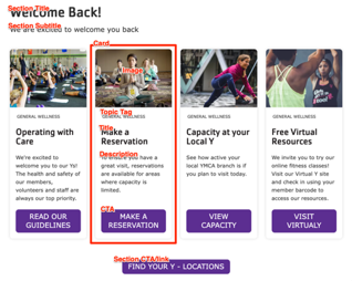
- Section title: Displayed as a heading above the cards.
- Section subtitle: Displayed below the heading.
- Section CTA/link: A link button displayed below the list of cards.
- # of columns: Allows 1- to 4-columns of cards.
- Cards: Add up to 4. Each card has:
- Title (required)
- Image: Chose from the library or add a new image to be displayed behind the card text.
- Description: A full text editor to add card content.
- Topic Tag: This is displayed at the top of the card and can be used to group cards visually.
- CTA: A link at the bottom of the card.
Then save the block:
- Click Add block in the editing pane.
- Save and publish your changes.
Last modified June 16, 2023: DS-783 docs: Add screenshots and update fields for v1 components (2659cc30)
